![]()
To turn raw data into insights, analyzing the data is crucial. Power BI provides plenty of tools for effective data analysis. From this blog, we will learn about various techniques to analyze data in Power BI. This blog will cover the following topics.
- Introduction to Power BI
- What is Data Analysis?
- Explore Power BI Desktop
- Learn Data Analysis in Power BI
- Conclusion
Introduction to Power BI
Power BI is a business analytics tool that Microsoft owns. It is one of the leading business intelligence tools trusted by most IT companies in the market to improve their business growth. It provides advanced analytic tools, reports and visualizations. Power BI is much versatile and platform-independent tool that user can embed on the cloud, mobile and web apps.
What is Data Analysis?
Data analysis is a process of inspecting, transforming, and monitoring to turn raw data into valuable insights. Data Insights helps in making the required decisions for the growth of business and company. To lead a data-driven approach for a business, it is important to analyze the data in deep. Various techniques for Data Analysis in Power BI will be interesting and beneficial for you to learn.
Explore Power BI Desktop
Power BI Desktop is a computer application that contains all the features used for analyzing data. You can download this application from Microsoft’s official website or store.
Know Your Workspace
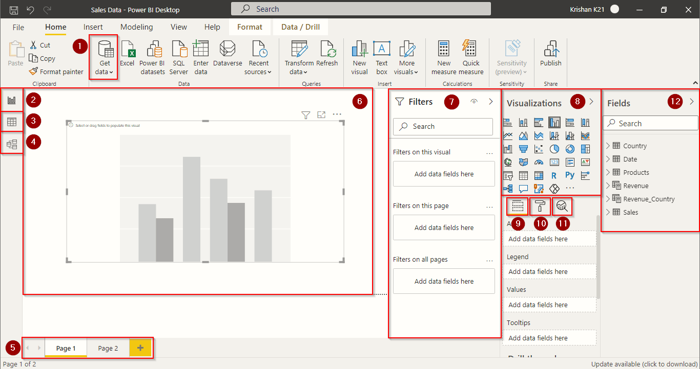
- Use this ‘Get Data‘ option to import your data from various sources like Excel, Azure SQL Server, Web and many more.
- ‘Reports‘ tab shows all the visualizations and reports that are created.
- ‘Data‘ tab is used to view and modify all the imported data.
- ‘Models‘ tab is used to create and manage multiple tables’ relationships.
- These are the number of pages or reports used in the project. Click on the plus icon to add a new page.
- You can paste visualization, charts and graphs in this area.
- ‘Filters‘ window contains all the filters that we can apply to our visualization and charts.
- The ‘Visualizations‘ window contains all the charts that user can use in a report.
- This is the ‘Fields‘ section that is used to provide data to the visualization chart.
- This is the ‘Format‘ section to enhance the appearance of the chart.
- This is the ‘Analytics‘ section to adjust the visualization.
- ‘Fields‘ window contains all our imported data and tables.
Import Data
To import data, visit ‘Home‘ and press the ‘Get Data‘ option in the menu. Choose your data source and import it. For beginners, simple data with fewer entries will be easier to understand the concept. If you want to follow the steps with us, you can use our sample data. Download our sample data from here.
Read More: About Microsoft Data Analyst. Click here
Learn Data Analysis in Power BI
Power BI provides various tools and charts to analyze data efficiently. We will use some of the basic techniques for data analysis in Power BI to generate valuable insights.
Explore Statistics
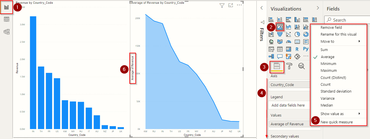
- Visit the ‘Reports‘ tab to start creating visuals and charts.
- Select or drag any visualization and paste it on the screen. As shown in the above image, we used a stacked column chart on the left and an Area chart on the right.
- Visit this ‘Fields‘ section to manage your charts or visualization.
- These are all the properties of a chart, and these properties change depending on the chart you select. You can play with all these properties to learn them better. Let’s discuss some most used ‘Fields’ in a chart.
- Axis – It is the X-Axis of the area chart. The fields section is currently assigned with Country Codes in the above image, and the same is reflected in the chart on the X-Axis.
- Legend – This field is used to compare data present in a single field. When some field like Country is assigned in Legend, the chart will show the country various colours to compare them easily.
- Values – This is the Y-Axis of the area chart.
- Click on the drop-down button present at the end of the values field. Here you can apply some operators on the values field.
- Power BI will reflect all the changes you made in the fields section on the chart. Here, our graph will change the shape depending on the operator and the resultant values on the Y-Axis.
Play with different visualizations and the field settings to better learn the functioning of Power BI.
Check Out: What is Microsoft Power bi? Click here
Group And Bin Data
Grouping in Power BI allows merging different categories into a single group, whereas binning allows refining the size and figures used in representing the data. For data analysis in Power BI, grouping and binning plays an important role.
Group Data
It might be difficult to analyze the various fields of data individually in analysing data. Suppose we have data records from various countries and want to group this data based on continents. In our case, we want to create two separate groups, one for Asian countries and the other for the countries that lie outside Asia. Now, we will see the simplest method to create our desired data group.
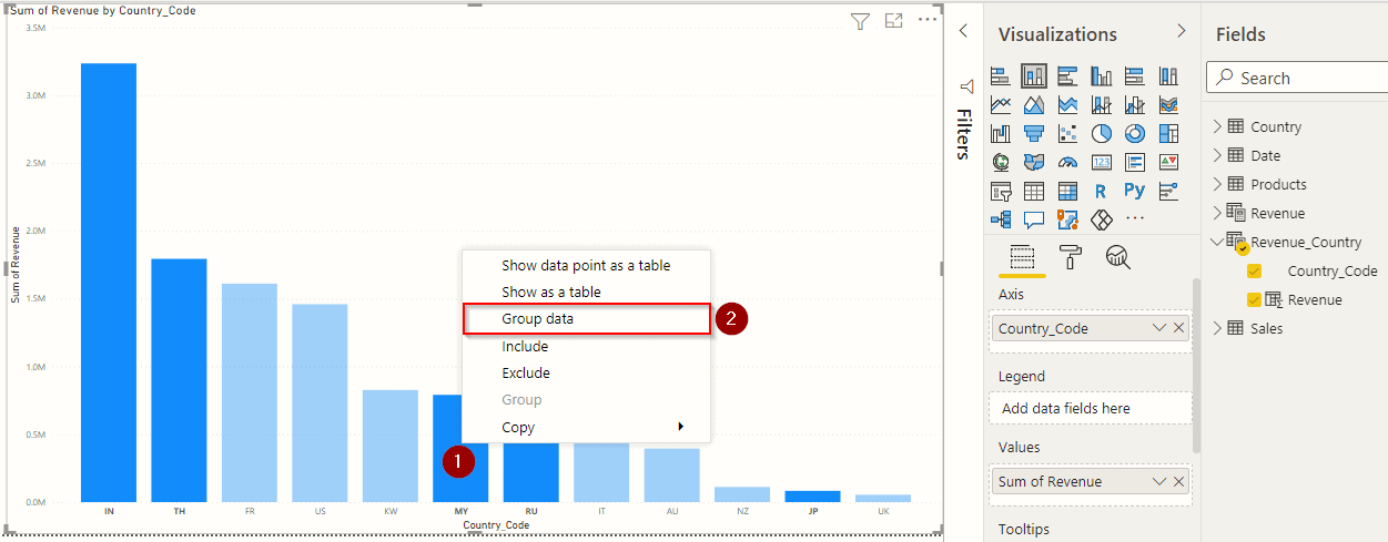
Use any bar chart and apply some fields on the axis. We used country codes on the x-axis and revenue on the y-axis.
- Select some of the country bars that belong to Asia and right-click on them.
- Click on the ‘Group Data‘ option as highlighted in the above image.
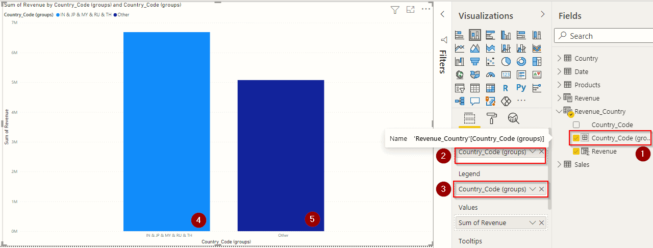
- After grouping, you will see a new group field on the ‘Fields‘ window, as shown in the above image.
- Drag the newly created group field to your Axis.
- Also, drag the group field to the legend field. This legend field will change the colours of both groups to compare them easily.
- After completing the above steps, this group of Asian countries will be shown on the screen as highlighted in the above image.
- This is the other group that is left by grouping all the Asian countries.
This grouping technique allows comparing multiple groups based on different categories.
Also, Check Our blog post on Azure Power bi. Click here
Bin Data
Binning data helps refine the data figures. Suppose we have some sales data with the customer ID and the number of product quantities they purchased. We want to compare the initial customers and recent customers with product quantity using a bar graph. This will not be feasible to use a bar graph if the number of entries is huge. In this case, we can use binning to divide our entries into different chunks. Remember that binning can only be applied when both Axis of the graph contains the Integer or Number fields.
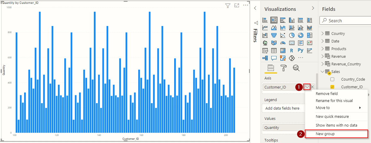
We used a clustered column chart and applied the fields to it. Customer ID is applied to the ‘Axis‘ and Quantity in the ‘Values‘. You could see that this chart is a bit congested, and imagine the scenario if we had more entries in our data. To make this chart clear, we will use binning.
- Click the drop-down button on the ‘Axis’ field.
- Then click on ‘New Group’ as shown in the above image.
The Groups window will appear on the screen, as shown in the above image.
- Enter the name of the bin that you want to create.
- If you have integer values on the axis, the group type will default to ‘Bin.‘
- Here you can choose two different Bin types. We will use ‘Number of Bins‘ to see the exact numbers of the bars on your chart. ‘Size of Bin‘ is used to divide the bars based on the bin size.
- This is the data field that is used in creating bins.
- ‘Min value’ is the first value of the entries in a Customer ID data field.
- ‘Max value’ is the last value from the entries that are present in that field.
- ‘Bin Count’ is the number of bars that you want to see on your chart.
- Bin size is automatically calculated by Power BI using the formula Bin Size is equal to (Max value – Min value)/Bin Count.
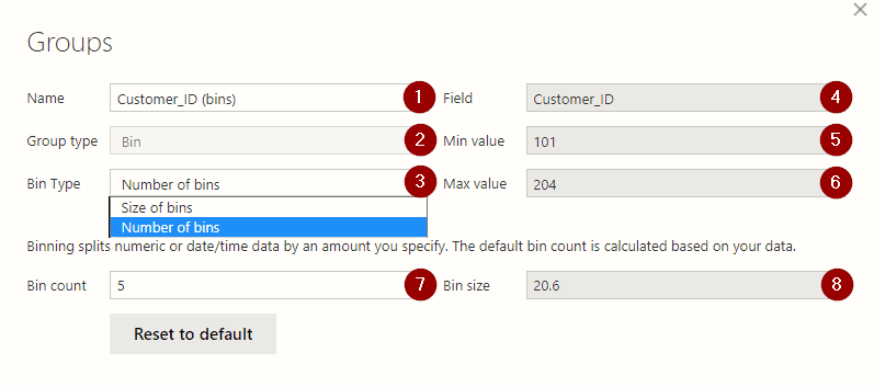
- After applying all the changes, you will see a new field created on the ‘Fields‘ section with your name.
- Drag the newly created field into the Axis.
You will notice that all the bars are grouped into some bins. All the entries are now divided into an equal number of ‘Bin Size’.
Also Check: Power bi vs Tableau; know their major differences!
Identify Outliers
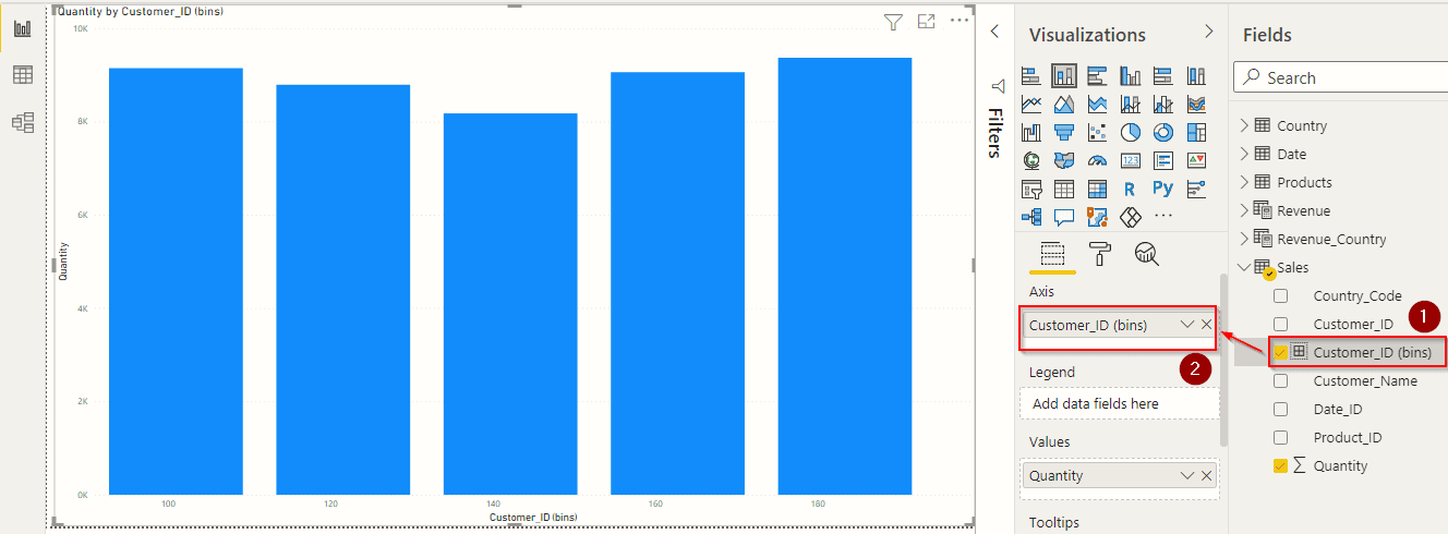
Comparing the most and least productive data values helps us identify the outliers. We can easily identify the outliers in Power BI with just a simple scatter chart.
Select a scatter chart from the Visualizations and apply all the fields to the scattered chart.
- We used Product Name in the Legend, Quantity in the X-Axis, Revenue in Y-Axis and Revenue in the Size. Here Size of the circle depends on the field Revenue that we have used.
- Now, notice the circles in the scatter chart. The blue circle on the top is the product that brings more revenue.
- The Red circle on the top right is the product that brings more purchases, and the size of the circles shows the revenue it brings.
Similarly, all the circles show some properties in this scatter chart. With this single scatter chart, we can bring more valuable insights.
Also, Check: Our blog post on Dax Power BI. Click here
Apply Clustering
Clustering is much similar to grouping and binning. In a scatter chart, we can have an infinite number of circles if the numbers of records are huge. So it is better to divide those circles into clusters. Power BI automatically calculate the clusters based on their values and properties they reflect.
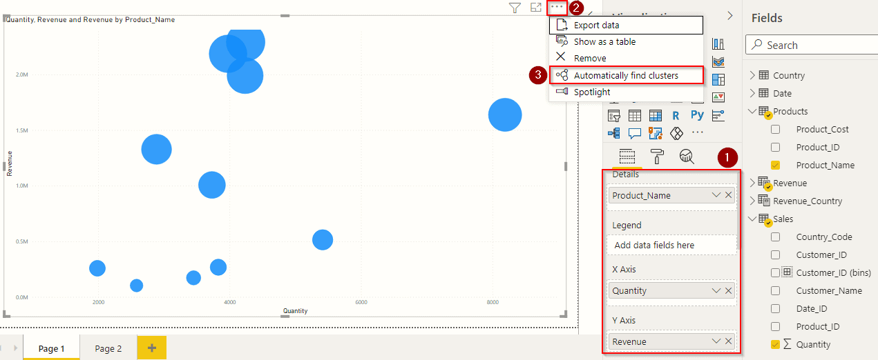
Use a scatter chart and apply the fields as shown in the above image.
- We used Product Name in the details, Quantity in X-Axis, Revenue in Y-Axis and Revenue in Size. We left Legend empty because we will use our cluster field in this area.
- Click on the ‘More Options‘ at the top of the scatter chart, as shown in the above image.
- Then click on the ‘Automatically find Clusters‘. This option will not be visible if you have used the wrong fields in your scatter chart.
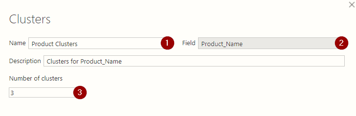
This cluster window will now pop up on your screen.
- Enter the name of the Cluster that you want to use.
- This is the fields name that Power BI will use in creating clusters.
- Enter the number of clusters that you want to create in your chart. Leave this section empty if you want Power BI to automatically create default clusters for your data.
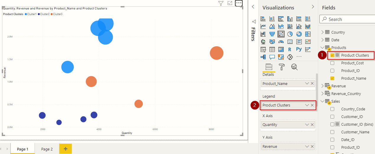
- A new field will be added, as shown in the above image.
- Drag the newly created cluster to the legend field.
Your scatter chart will now be divided into the number of clusters that you want. In our case, the purple colour cluster at the bottom is the product names that bring the least number of sales and revenue. The orange colour cluster brings average revenue but more sales in quantity. The blue colour cluster brings max revenue but an average number of sales.
Also, Check Our blog post on Power Query. Click here
Time Series Analysis
Time Series Analysis helps visualize the time-based scenario. Till now, we have learned the advantage of the scatter chart. We will now learn to make use of a scatter chart to analyze the data with time.
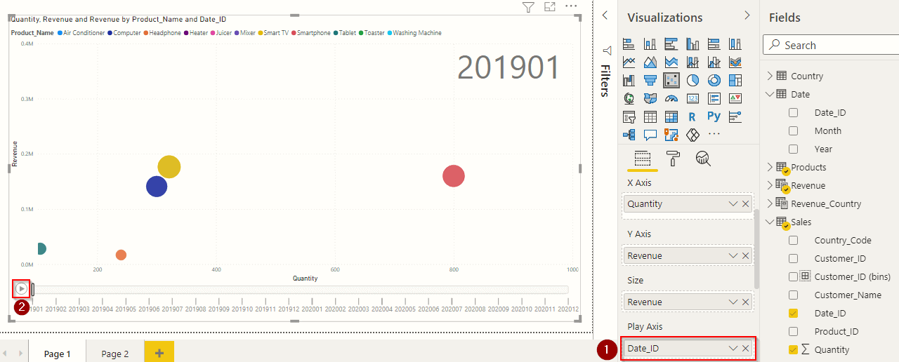
Before applying the below steps, make sure you have used the right fields in the scatter chart.
- To use the time series analysis, you only need to add a time or data field in the ‘Play Axis‘ of the scatter chart, as shown in the above image.
- Tap this play button to start the animation of the scatter chart.
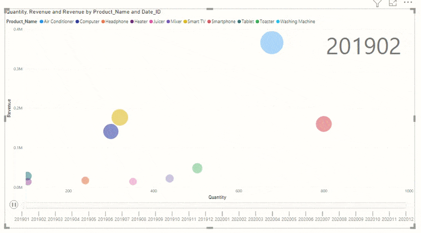
In the above animation, you can see how the values change with time. These animations are very helpful to compare the product sales and analyze the company’s overall growth.
Read More: About Pl-300. Click here
Conclusion
Power BI is no doubt an effective tool for analyzing data. This tool can help data analysts to keep an eye on the huge data generated by the company. Through this blog, we are now familiar with the ways for effective data visualization in Power BI. We have learned some basic techniques that you can use to generate valuable data insights.
In this blog, we only learned the basics of Data Analysis in Power BI. If you want to get deep knowledge and want to become a Data Analyst to solve business problems, then our Microsoft Certified Power BI Data Analyst Associate [PL-300] Certification course will help you achieve your dreams. It will help you to learn and unlock all the features of Power BI to its full potential.
Get Certified For Power BI: Microsoft [PL-300]
Microsoft Certified: Power BI Data Analyst Associate [PL-300] Certification is a great start to prove your Power BI skills in the job market. This certification is very useful to Data Analysts, BI Practitioners or business report designers who use Power BI to make use of their data in creating visualizations for customers or organizations for insights.
References
- Introduction to Microsoft Power BI Platform | Everything You Must Know
- Exam PL-300: Microsoft Power BI Data Analyst | A Replacement Of DA-100
- Microsoft Certified Data Analyst Associate [PL-300] Step By Step Activity Guides (Hands-On Labs)
- Case Study: Display Live Data Streaming Using Power BI Service
- Introduction to Data Modeling in Power BI
- What is Power Query | Microsoft Azure Power BI Tool
Next Steps to begin with PL-300 Certification:
In our PL-300 Certification Training Program, we’ll cover 10+ Hands-On Labs. If you wish to start your journey towards becoming a Microsoft Certified: Power BI Data Analyst Associate, try our FREE CLASS.


Well written article! I really like the way you have explained each section by numbering them and describing what each does, and in sequence, which is really helpful.
Hello Ravi, Glad you liked our post, stay tuned for more informative blogs
Regards
Team K21
This is one of the great blog. very nice and creative information. iam really impressive your topic. Thanks for sharing.
Hi Shad,
We are glad you liked our blog.
Please stay tuned for more informative blogs link this.
Thanks and Regards
Rahul Dangayach
Team K21Academy
I think using “data analysis” as a label creates unrealistic expectations. Most would expect “analysis” to be more useful (basic statistics, other processes similar to those considered normal in scikit-learn,etc.). The charts are pretty, but I see almost nothing that makes Power BI useful in real “data analysis.”
I have an immense amount of data to analyze, and would appreciate more emphasis by those posting about Power BI on the analysis capabilities of Power BI, and (much) less emphasis on creating attractive reports for those higher up on the corporate food chain. Sorry, but emphasizing the report design aspects, while (mostly) ignoring the “data analysis” aspects seems counter-productive.
What I (and many others) would really like to know is “What can Power BI really do except generate spiffy looking reports.”
Hi Technical Writer,
The term “data analysis” can be interpreted in many ways, and Power BI does not offer all of the features that you might expect from a data analysis tool. However, it does have several capabilities that can be useful for data analysis, including:
Data exploration: Power BI makes it easy to explore your data visually. You can use charts, tables, and other visuals to quickly identify trends, patterns, and outliers in your data.
Data cleaning: Power BI has several features to help you clean your data. You can remove duplicate values, fill in missing values, and standardize your data formats.
Data modeling: Power BI allows you to create models of your data. This can help you to understand the relationships between different variables and to make predictions about future outcomes.
Data visualization: Power BI has a wide variety of visuals that you can use to communicate your findings to others. These visuals can be customized to your liking and shared with others through a variety of channels.
Machine learning: Power BI can be used to build machine learning models. This can help you to automate tasks and to make better decisions based on your data.
While Power BI does not offer all of the features that you might expect from a data analysis tool, it does have several capabilities that can be useful for data analysis. If you are looking for a tool to help you explore, clean, model, visualize, and share your data, then Power BI is a good option to consider.
Here are some additional resources that you might find helpful:
If you would like to deep dive and learn more about Power BI so would recommend you attend the 60 – 90 mins free master class where you can learn more about data and Power BI concepts.
Please check the link below:
https://k21academy.com/pl30002
I hope this helps!
Thanks and Regards
Rahul Dangayach
Team K21Academy