Enhancing the user experience of the redRail app. Mobile app redesign — UI/UX Case Study
In this article, I will share my detailed process and reasonings behind the design decisions to redesign the redRail mobile app.
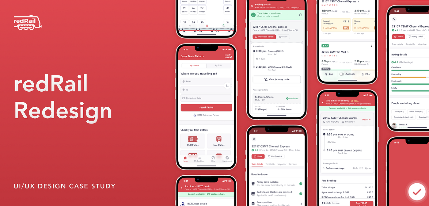
Project Walkthrough
Now before we get started, below is a presentation for those who want a TL;DR version 😁
Do check out my beautiful Behance presentation as well. Anyways, now let’s get into the case study
Disclaimer
This is a personal project. I was not commissioned by redRail to redesign their app.
Background 🤔
What is redRail?
redRail is a popular online platform for booking train tickets, launched by redBus in November 2021. They are authorized IRCTC partner who aims to provide a seamless train ticket booking experience.
Why did I choose redRail and why the redesign?
I am a frequent user of redBus, which is a very popular online bus ticket booking platform. I travel a lot via bus and frequently book bus tickets on redBus. In stark contrast, even though I do travel by train, I very occasionally booked train tickets for myself and usually relied on someone else to book train tickets for me 😑
But why tho?
Even though I am tech-savvy, I have always found the train ticket booking process a little cumbersome and complicated. There are multiple things to consider like waitlist, coaches, and berths.
I did use different train ticketing apps like the official IRCTC app, Paytm, and the IRCTC portal to book my tickets, but I have always felt that the design of these apps can be much simpler and easier to use.
With redBus launching redRail, they simplified the ticketing experience to their credit. But the app still had massive room for improvement. So, I decided to take up the challenge to redesign the entire app from the ground up.
Here is the list of the areas of improvement, that I am talking about:
- Lack of visual hierarchy and clutter makes the users difficult to consume important information such as train details, train availability, route, etc.
- Lack of filtering and sorting option on the search results page.
- The IRCTC ticket confirmation page looked out of place with the app's design. And the entire booking process can be made a lot more straightforward.
- Adding a lot more useful information helps the user to take better decisions while booking the train ticket.
- Enhancing the post-ticket booking experience, and intuitively assisting users with timely notifications and updates during the journey.
- Revamping the UI, which felt pretty outdated with the current design.
I will elaborate on these further as we move through the case study. So, that being said, let’s get started ✌
UX Research 🔎
User Research
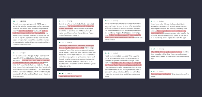
To gain some more perspective and understand the pain points of the users, I interviewed some of my friends and family, who have booked train tickets before (Some of them knew about redRail, some didn’t). I asked them to use redRail and to share their pain points.
I also interviewed a couple of friends who travelled on a train but never booked a train ticket to get additional perspectives. Here are my findings:
- The search results page was too crowded. It made them difficult to scan through the different trains on a particular route.
- The lack of sorting and filtering options on the search results page frustrated some users.
- The usage of abbreviations to indicate train availability status and train classes confused new users who were booking for the first time.
(⚡New insight)
Along with this, some of the existing users also complained that they usually couldn’t book tatkal tickets. Although tatkal tickets are last-minute tickets that open at a particular time of the day depending on the train classes, the users were expecting to receive some notification to help them in booking tatkal tickets (⚡New insight)
Competitor Analysis
I did competitor analysis of apps that were solving similar problems to redRail to ensure that I wouldn’t miss out on any key solutions implemented.
I studied existing design patterns of various booking apps (not restricted to only train ticket booking apps) which included redRail’s competitors, bus booking apps, flight booking apps, hotel booking, etc.
Some of redRail’s competitors include apps like Ixigo, Rail Yatri, Confirm Tkt, PayTm, and the Official IRCTC App.
After analyzing the user reviews, I figured out that most of the users are frustrated with the IRCTC ticket confirmation step in the booking process.
(⚡New insight)
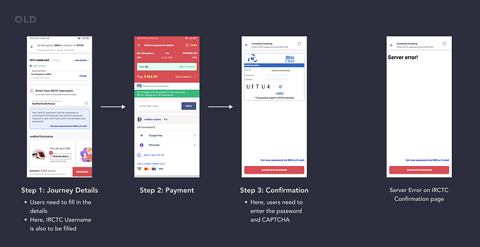
Let me illustrate this issue, with an example 💭
Let’s say that you search for trains from Udupi to Mumbai. Then, you select your preferred train class and now you want to book your ticket.
Currently, the steps to book a ticket are:
1. Fill in the ticket details
2. Proceed to payment
3. Confirm your ticket by entering your IRCTC password and captcha
Here’s where the problem lies. After completing your payment, you are asked IRCTC password, which not a lot of people remember. They scramble at that moment to retrieve the password. Sometimes the IRCTC page doesn’t load and your ticket is cancelled.
Although this is a problem of IRCTC and their policy and there’s not a lot that 3rd party apps like redRail can do, it is still a significant problem plaguing the ticketing experience.
I have proposed some solutions for the above-said problem as we go through the case study.
What you will see in this project ❓
This case study showcases my reasonings and insights into potential solutions to the issues that I find with the redRail app.
The entire case study is split into 2 parts:
- Pre-booking experience
- Post-booking experience
Now let’s dive into the redesigns 😎
The Redesign⚡


Now that you have seen the juicy parts, let’s dive in 🤿
Pre-Booking Experience ✨
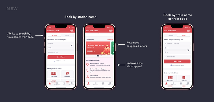
1️⃣ Home Page
There wasn’t any major flaw that stood out on the home page. However, some small issues could be solved to improve the overall user experience.
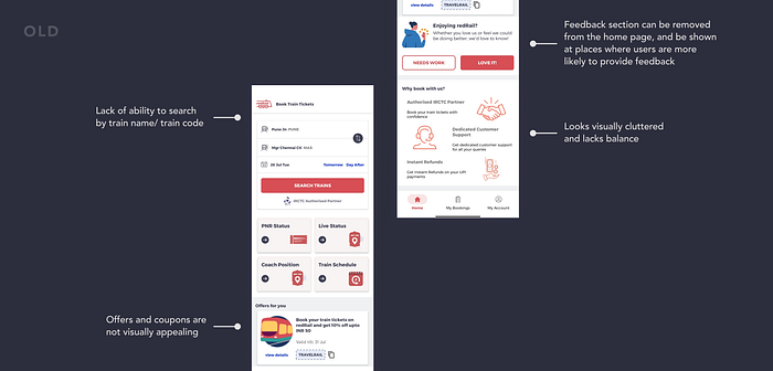
- The first issue was the lack of ability to search by train name/train code. I found through my research that, frequent train travellers are likely to book the same train.
For example:
Let’s say that you are a frequent traveler between Udupi and Mumbai. You are highly likely to book the “Matsyagandha Express”, which is a popular train on this route. People are more loyal to trains than busses 🤭
- The feedback section on the homepage can be removed from the home page and shown at places where users are highly likely to provide feedback.
Ex: After booking a train ticket or after sharing the train details - The overall visual appeal of the homepage can be improved.
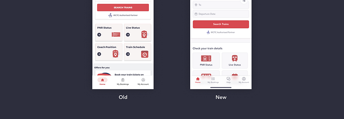
Bottom Tab Bar
Here, a new tab bar item “Help” was added. Originally, the help section was buried in the “My Account” tab. By selecting “Help” users are navigated to a new page that contains FAQs and the ability to contact support.
A translucent tab bar is employed in the new design which gives the app a premium feel and improves the overall aesthetics.
2️⃣ Search Results Page
The search results page is a content-heavy page. Its purpose is to:
- Show a list of trains on a particular route. This allows the user to scan for important data points like the duration of the journey, classes available, price, etc.
- Filter and sort the list based on the user’s preferences.
There were several problems in the search results page, that hindered the user experience:
Problem 1: Lack of visual hierarchy on the page
The lack of breathing space and clear distinction between the list of items made it difficult to scan through the different train options.
Solution:
- I increased the breathing space between the list items and gave outline strokes to each of the list items to make a clear distinction between them.

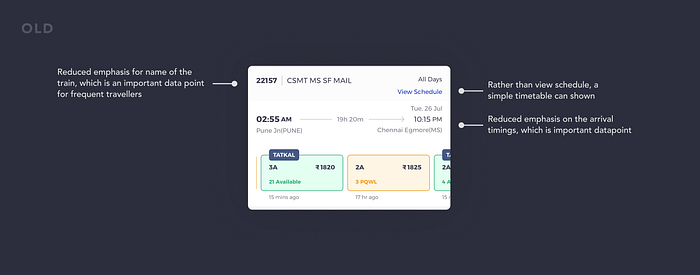
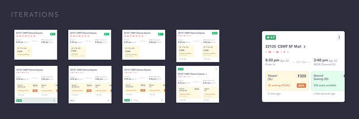
Problem 2: Visual clutter and broken information architecture in the Train details card
The information architecture is broken, which makes users difficult to scan through important data points in the train details card. There was a lack of the right amount of emphasis given to different pieces of information.
Solution:
- Firstly, I started by removing the “View Schedule” option and decided to show the timetable instead as it is easier to glance at.
- Then, to fix the information architecture of the card, I noted the most critical data points and put them under 3 buckets i.e primary, secondary, and tertiary based on the order of importance. This helped me to give proper emphasis to important pieces of information on the card.
Additional improvements:
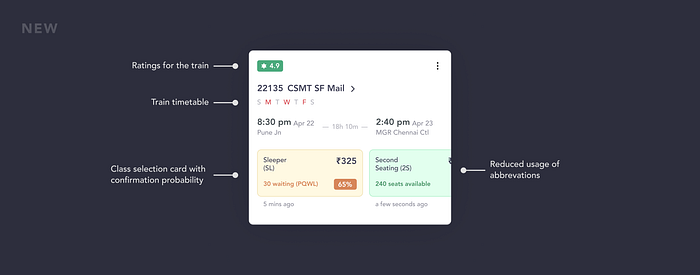
- I decided to add a reviews feature to redRail, where previous travellers can add reviews for a particular train. Social proof helps users in their decision-making process.
- I also gave special attention to copy used in the class selection card. Other competitors complicated the information on this card by using IRCTC abbreviations for showing the availability status of a particular class.
⚠️ Time to pay attention!
For example:
Let’s say that the availability status of the sleeper class of a particular train is on a waiting list and is under the RLWL quota. Now to show this information, several competitor apps denote the status like RLWL28/WL18.Where RLWL 28 denotes the total number of people who had applied under the RLWL quota, whereas WL18 is the current status of the ticket. As a user, only the number beside WL is important which helps in the decision-making process 💯
RedRail, on the other hand, has simplified this information, by only showing the current status of the ticket. I went further ahead by adding confirmation probability, which shows the percentage chance of waitlist tickets getting confirmed.
P.S: I have also reduced the usage of abbreviations throughout the app, helping users who are booking for the first time.
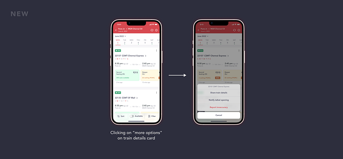
- I also went ahead and decided to add the “Notify Tatkal” feature. This feature sends timely notifications to the user, notifying them about the opening of tatkal bookings of a particular train on a particular day.
- Along with this added ability to share the train details and to report inaccuracies with train details.
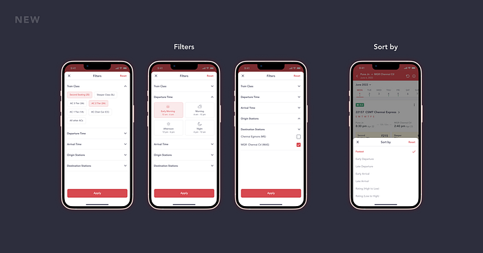
Problem 3: Lack of sort and filters option
Sort and filters are basic options on a search results page. They help users refine the results based on their preferences. Strange enough, redRail has not implemented this basic feature yet.
Solution:
- I add the sorting and filters option onto a separate bottom bar. I also added the “Available” toggle as a separate tab bar item because through my research insights, I found that this was the most applied filter while refining the search results page.
Additional improvements:
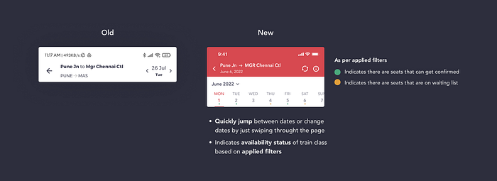
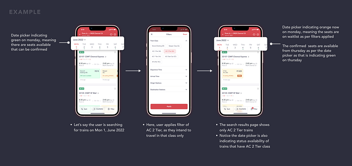
- Designed a new date picker for the search results page. With this new design, the user can quickly change the date by just swiping the page. Also, the date picker indicates trains available as per the user’s preferences 😎
Wondering how this works?
- By default, the date picker indicates whether there are seats that can get confirmed booking on a particular route irrespective of the train classes.
- Let’s say, the user applies filters to refine the results page. Now the date picker indicates availability based on the filters applied. It shows green colour if there are seats that can get confirmed, or it shows orange colour, to indicate, that there are seats that are on the waiting list as per the user’s filter.
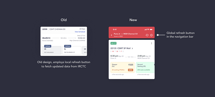
2. Added a global refresh button in the navigation bar
- With the old design, users had to click on each of the class selection cards to know the availability status and price. As this data is dynamic, most apps employ the same design. But the issue is, that this interaction becomes very repetitive when you want to compare different trains and classes.
- So, adding a global refresh button instead of a local refresh button eliminates this repetitive interaction. Users can just click on the global refresh, which refreshes all the class selection cards at once by fetching updated data from IRCTC.
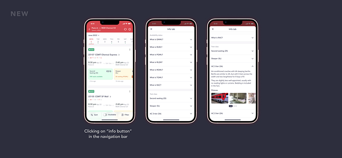
3. Introduced the info tab to the search results page
- The info tab is one of the “good to have” features that are added with the redesign. It serves two main purposes for the users. One is to provide a better understanding of the availability status. Two is to provide useful information on the train classes which aids users in decision-making. This information is very helpful if the user wants to book a seat for a new class that they are unfamiliar with.
3️⃣ Search Page
Alright, now moving on to the search page. There are 3 key improvements done with the new redesign.
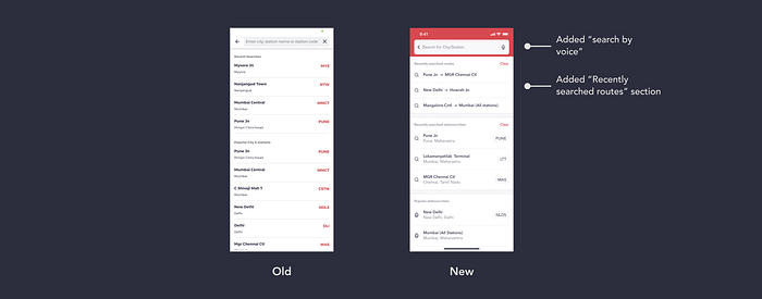
- I added the ability to search by voice. This will further improve the functionality of the search page and will help users who have difficulty typing like elders and parents.
- I also added “recently searched routes” on the search page, which will speed up searches for users who frequently take the same route
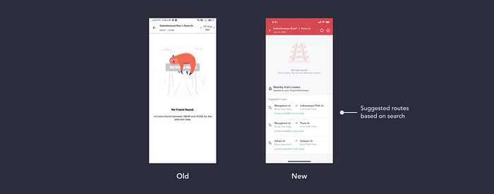
3. Redesigned empty state
Let me explain this with an example
Let’s say, the user searched for trains on such a route, where no trains run between. Previously, redRail showed an empty state denoting that no trains runs between the two searched stations. This is a dead end in the user journey 😕
So, to avoid an abrupt end to user journeys, I redesigned the empty state, where redRail now shows nearby train routes based on destination or origin stations. This improves the conversion rate which is an important business metric for redRail.
4️⃣ Train details page
Train details are yet another “Good to have” feature within redRail. It presents a host of information for the user who wants to learn more about the train before proceeding to book the ticket. You could only get the train schedule and some basic information about the train in the previous design. I wanted to improve this section even more by including additional information that users will find useful when booking their tickets.
In the new design, I have introduced 4 tabs within the train details page:
- Train details
- Timetable
- Map view
- Reviews
Along with this, the user can share the details page and has the option to get notified for tatkal booking openings.
Let’s now dive into the details...Shall we?
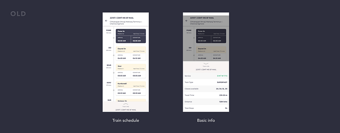
1. Train details
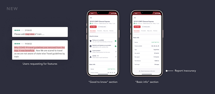
- The “Train details” tab is divided into two sections. One is a “Good to know” section that includes useful information such as whether a pantry car is available or whether bedrolls and blankets are provided. This is useful because, IRCTC had stopped some of the services citing covid restrictions, so resumption of any service or addition of any new service can be provided here.
- The second tab is “Basic info,” which is simply a table with train and route characteristics.
2. Timetable
Not that the old “train schedule” design was wrong, but I was thinking of a specific design style. So I redesigned the “Timetable” to make it look consistent with all other screens.

3. Map view
The “map view”, as the name implies, depicts the train route on a map. This feature is especially useful for users who are unsure of the boarding station’s location. The map view also allows users to navigate through Google maps by clicking on the station.

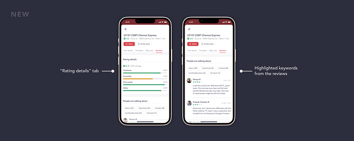
4. Reviews
Reviews are essential as they help users make confident decisions while booking a ticket. The “Reviews” tab is divided into two sections:
- One is “Rating details” which shows the breakdown of the rating that is shown on the train details card. It contains critical data points like Cleanliness, Punctuality, Food quality, and Safety.
- The “People are talking about” section has a list of reviews by recent passengers. It also has a filter that highlights keywords based on the reviews.
5️⃣ Booking flow
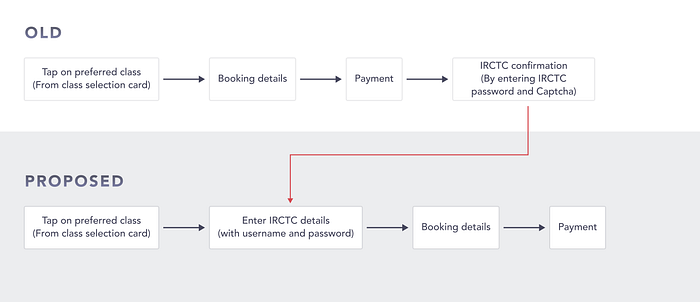
To understand this let’s revisit our problem statement and insights once again. As I told you earlier, most users are frustrated with the IRCTC ticket confirmation step in the booking process.
Most third-party apps, usually ask for the IRCTC password to get the ticket confirmed. This step is after the payment has been completed by the user. The problem lies in the IRCTC confirmation page not getting loaded, or users forgetting their passwords and requesting new passwords frequently.
Owing to users’ frustrations, I have proposed a new booking flow. I am keeping the IRCTC login as the first step in the new flow. Also, my assumption is that most apps and websites use payment confirmation as the last step to confirm an order/booking. So, I have also gone ahead with the same. I believe that this new flow would also eliminate the need for refunds in case of an IRCTC server outage.
That being said, let's take a look at the screens
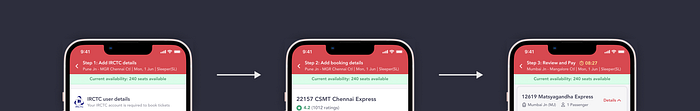
Step 1: Enter IRCTC details
As you can see with the proposed flow, I have kept IRCTC details as the first step. Here, users are asked to enter their username and password, and the details are verified through IRCTC.
I have also removed the captcha requirement from the screen, as there are much better methods of bot detection. Some of the techniques that can be used:
- The honeypot trap approach can be used in this step where invisible fields are added that are only visible to bots and not humans. Bots can be easily discovered and eliminated this way.
- Also, time-based forms can be used, where a minimum time to complete the form is set based on historical data. This way a bot that usually fills forms faster than humans can be detected by the system.
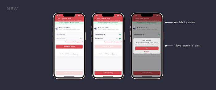
Here, I have made the IRCTC details page’s design match the rest of the app’s design which was not previously the case. Along with that, I have added a “Save login info” alert to help users auto-fill the login details as they need not remember IRCTC passwords every time.
P.S. Although some phones display “Save login info,” this was very inconsistent. This alert appeared at times and not at others.
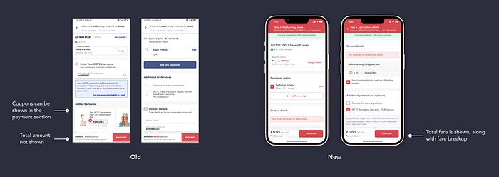
Step 2: Add booking details
This screen was majorly a visual upgrade. Along with this, I made the following changes:
- I removed the “redRail Exclusive” section that displayed coupons and special offers. It made much more sense to show this on the payment page instead.
- Previously, only the amount per person was shown. I decided to show the total amount (incl. tax), and also added an option to show the fare breakup.
Step 3: Review and Pay
I redesigned the “Review and Pay” page with a better structure to make it easier for users to consume the content. In addition, I have simplified the payment options by displaying only the most important options up front.
Previously, the fare breakdown was hidden within the “View details” option. I took it down and put it on the main page instead. I’ve also included coupons that were removed during the “Add booking details” step.

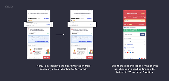
Edge Case (Change boarding station):
To explain this, let me give you a scenario:
⚠️ Time to pay attention
Let’s say a user is booking train from Karwar to Udupi. He wants to book in MatsyaGandha Express, which runs between Mumabi and Mangalore.
But unfortunately, for him, all the seats on the train on a particular day are on waiting list 😞 Also, as per priority order, the waiting list seats from origin station are going to get confirmed before the intermediate stations.
Therefore, the user decides to book train from Mumbai to Mangalore, but changes his boarding station to Karwar. This way, the user is up in the priority list and has higher chances of the ticket getting confirmed, by paying a premium 🙂
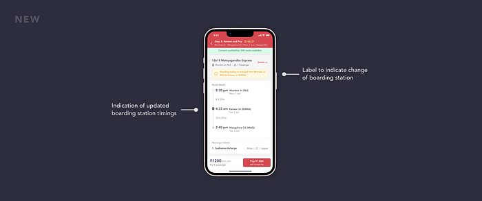
Here, in such scenarios, even if the user changes his boarding station, there is neither indication of the change of station nor the boarding time.
So I added a label to indicate the change of boarding station. In addition, I have also included boarding station timings in the review section, which is essential and was missing in the previous design.
Post-Booking Experience 🌟
The post-booking experience had a lot of room for improvement, from timely notifications to updates and live status. Although all major features were present, there was a lack of intuitiveness, which could have resulted in a better overall user experience.
1️⃣ Booking details
The booking details page can be accessed from the “My bookings” tab. They are also displayed, once a ticket is booked by a user. Coming to the redesign, there were several improvements done like restructuring the information displayed, to improving existing features.
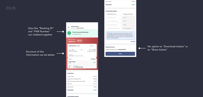
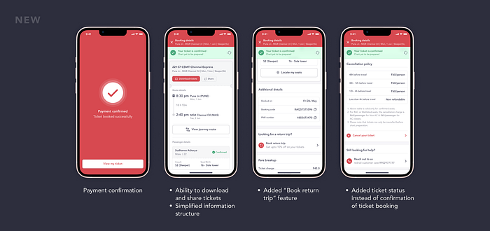
- I changed the ribbon, which previously showed “confirmation of ticket booking” to “status of the ticket”, which is far more essential information. Users can also refresh the ribbon to get updated status from IRCTC.

- I also added options to download the tickets and share the booking details with others.
- Furthermore, I expanded the functionality in the booking details page by adding options to view journey details, which when clicked shows the route map and train schedule, and to locate passenger seats when seats are confirmed. Many competing apps do include a CTA to locate seats. However, I enhanced the functionality by displaying passenger details when clicked on the confirmed seats.

- Finally, I enabled the booking of return tickets for the same route. Incentives such as a 10% discount on the ticket can be used to encourage the use of this feature.
2️⃣ Home Page
Now you might be wondering, this section is already discussed right? So what’s new here 🤔
Here, I wanted to solve the lack of intuitiveness, that I had mentioned earlier. Let me explain this with the help of a scenario
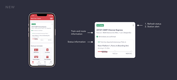
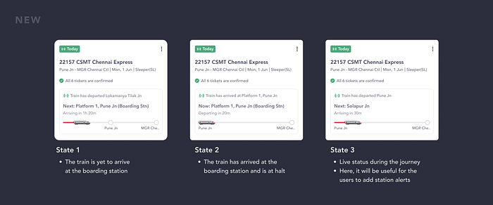
Let’s say that you have booked a train using redRail. Now in order for you to track the live location of the train, you have to go to “Train status”, search for your train, and then receive information about the same 😑
Instead of this, what if, the app shows you the live location of your train on the home page itself? Wouldn’t that feel magical? 😋
Although this is a very small touch, I believe this would enhance the overall user experience.
Let's take it up a notch now...Shall we?
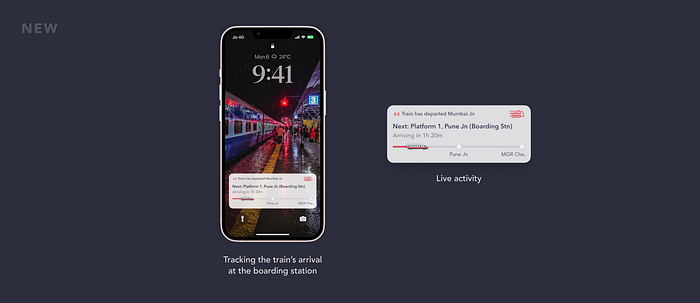
Live Activity
Live Activities are interactive notifications that are always up to date, allowing users to monitor what is going on in real-time right from the lock screen. This feature was introduced by Apple in the iOS 16 update.
So, I decided to design live activities for redRail, so that users can easily keep track of the train from their lock screen. This feature would be particularly useful when users are tracking the arrival of their train at the boarding station.
3️⃣ Notifications
At the moment, redRail does not do a really good job with the notifications. There are also no useful notifications about train arrival, delays, or other important updates. Therefore, providing timely notifications and updates will enhance the overall product experience.
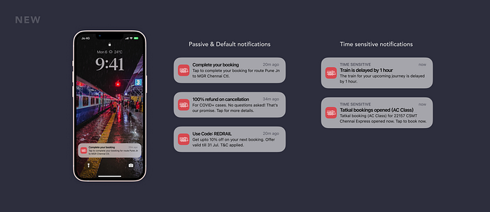
As per the iOS 15 update, there are majorly 3 types of notifications. These are “Passive”, “Active” and “Time-Sensitive” notifications.
Passive and Active (Default) notifications:
- When the user discontinues their booking for some reason or the app crashes accidentally while a user is booking a train ticket
- When the app shows offers and incentives to encourage users to book through redRail
- Reminding users of available coupons to use them in their next booking
Time-Sensitive notifications:
- When the train is delayed from its scheduled arrival time
- When tatkal bookings are opened for a particular train class (Notify tatkal booking feature)
Introducing Dark Mode 🖤
To top it all off, here’s a fresh coat of dark paint to redRail!

Takeaways and Learnings💭
This project has truly put my product design skills to the test. There were several challenges along the way, ranging from identifying problems with the current app to improving the overall visuals.
- First and foremost, my admiration for IRCTC has quadrupled. The complexity of the ticketing system which considers numerous reservations, policies, and preferences has just awed me.
- This redesign helped me to understand the intent behind every design decision and the whys of the product. Understanding users' pain points, thinking about scenarios, and working with feedback have pushed me in the right direction.
- Speaking about designs, I have now truly realized the power of auto-layout. It simply speeds up your work on Figma by 10x. I just wish I had used auto-layout earlier in my previous projects…I would have saved a ton of time instead of pixel-peeping and pushing for alignment :(
- The devil is in the details. Every small change in design can have a significant impact on the overall user experience.
I would love to thank Goutam Naik, for helping me to understand the problem space better and helping to shape my thought process as well 🙏
And that’s it…Thanks for sticking to the end! ❤️
Woah that was such a lengthy read. Hope you found it useful and interesting. If you have any feedback, suggestions, questions, or anything in general feel free to hit me up on my social handles. Looking forward to connecting with you soon 🤟🏻
P.S: I am looking for opportunities as a product designer. If you think that I can contribute value to your team and seem like a good fit for your organization, please do reach out through my social handles 😇
My socials:
Check out my other articles on medium.